


Key takeaways
• Design is translation, not decoration. We turn technical complexity into products that feel clear, fast, and natural. The craft lives in the workflows and edge cases, not the splash screen.
• We design across domains. Finance, trading, telemedicine, e-learning, video platforms, surveillance, dating. Each domain has its own logic; the design team learns it before sketching.
• AI tools amplify, they don’t replace. Visily, Figma AI plugins, and LLM-assisted research compress exploration 2–3×. The designer’s judgment work — what the user actually needs — is what you’re paying for.
• Design stays with the project from kickoff to launch. Not a Figma hand-off. Designers sit in sprints, defend accessibility, catch UX regressions, and own pixel-perfect implementation reviews.
• If you need a design partner who earns their seat, book a scoping call. You’ll meet the lead designer before signing, and leave the call with a design plan, not a pitch.
Why Fora Soft wrote this piece
This is a behind-the-scenes look at how we design products at Fora Soft — written for founders, CTOs, and product leaders who are evaluating development partners and care about whether the team can actually design, not just pixel-push. Over 20 years we’ve shipped 625+ products in video, AI, e-learning, telemedicine, surveillance, and fintech. See case studies like BrainCert, V.A.L.T., and Tradecaster for the shape of work our design team has carried.
The piece answers five questions in one place: how our designers work, which tools they run, how AI fits in, what you get in the first weeks, and when a design partner is worth bringing in versus staffing internally. No aesthetic gushing — just the working patterns that keep our projects shipping on scope.
Need a design team that designs, not just decorates?
Book a 30-min scoping call. Talk to the lead designer, not a salesperson. Leave with a design plan and a realistic timeline.
Design is translation, not decoration
The most useful mental model we’ve built over 20 years is that product design is a translation job. The raw material is a complex domain — a trading platform, a telemedicine intake flow, a live-streaming classroom — and the output is a screen a stressed human can use in 6 seconds without reading documentation.
That translation requires two things in equal measure: empathy for the user and fluency in the domain. Empathy without domain fluency gives you beautiful interfaces that miss the workflow. Domain fluency without empathy gives you dashboards only power users love. Our design team is hired and trained to hold both.
What it looks like in practice: before designers open Figma, they walk the workflow. On a streaming app, that means shadowing a streamer and a viewer. On a trading platform, that means learning how a trader scans depth-of-market. On a telemedicine product, that means understanding the clinician’s 90-second triage. The screens come last.
Reach for this design approach when: your product lives in a domain with expert users, unforgiving feedback loops, or regulated workflows. Surface-level design doesn’t survive first contact with real users in these contexts.
Our design process, phase by phase
Phase 1 — Research (1–2 weeks). User interviews, competitor teardowns, domain expert shadowing, accessibility audit of any existing product. Output: a problem brief, personas that aren’t fabrications, and a list of the constraints designers will respect.
Phase 2 — Wireframing (1–3 weeks). Low-fidelity wireframes in Visily or Figma, interactive prototypes in Axure or Figma for validation. The analyst and lead designer iterate tightly; PMs and stakeholders approve the skeleton before any visual design.
Phase 3 — Visual design + system (2–5 weeks). Design tokens, component library, primary flows in high fidelity. We build from tokens outward so the system is maintainable, not just screen-by-screen pretty. Accessibility (WCAG 2.2 AA minimum) is baked into tokens, not added later.
Phase 4 — In-sprint ownership (continuous). Designers sit in sprint reviews. They approve PRs against the design system, catch regressions, and maintain the component library as engineering evolves. This is where 80% of design debt accumulates if you skip it.
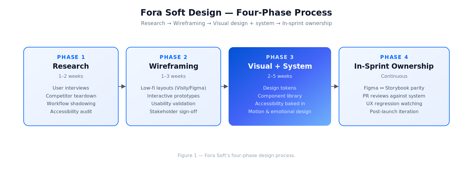
Figure 1. Our four-phase design process.
The tools our designers run (and why)
| Output | Tool | Why we pick it |
|---|---|---|
| Low-fi wireframes | Visily (AI) / Figma | 2× faster first pass; fast iteration with stakeholders |
| Interactive prototypes | Figma / Axure RP | Real-click flows for validation and usability testing |
| Visual design | Figma + tokens plugin | Source of truth; design-to-code handoff |
| Component library | Figma Libraries + Storybook | Parity between design and live component |
| Motion / micro-interactions | After Effects / LottieFiles / Rive | Production-ready animations without JS overhead |
| User research | Maze / UserTesting | Remote, fast, statistically sane |
| AI-assisted ideation | Claude / GPT + Midjourney | Exploring concepts, stress-testing variations |
For context on how we pick AI design tools, see our deep-dive on AI tools for UI/UX design.
How AI reshaped our design workflow
We’re not replacing designers with AI. We’re giving each designer an assistant that flattens the tedious parts so judgment work expands.
1. First-pass wireframes in minutes. Visily and Figma AI give us a starting layout from a prompt. Designers edit for fit and fidelity — they no longer stare at a blank canvas.
2. Research synthesis. 10 user-interview transcripts summarized and thematized by an LLM in 15 minutes instead of two days. Designers verify and sharpen, rather than transcribe.
3. Accessibility audits. LLMs with vision models catch contrast issues, hit-target problems, and ARIA gaps on a design. Read AI accessibility in UI/UX design for how we apply it.
4. Predictive UX. We’re embedding predictive UX patterns — anticipating user intent, surfacing likely next actions — into SaaS products where dwell-time and task completion are business KPIs.
5. Variation generation. When a team is unsure between two visual directions, we generate 10 concept variants overnight and narrow down with stakeholders the next morning.
What makes a great product designer (and what we hire for)
1. Research-first instincts. Starts with users, not with Dribbble.
2. Opinionated but evidence-driven. Defends choices with research and metrics, not taste.
3. Domain-agnostic curiosity. Can move from finance to telemedicine to surveillance in a year without surface-level treatment.
4. Systems thinking. Designs components, not screens; maintains the system as the product grows.
5. Accessibility as baseline. WCAG 2.2 AA isn’t a sprint-5 ticket. It’s a token decision.
6. Engineering literacy. Understands state management, API shapes, and perf budgets well enough to avoid expensive designs.
7. Emotional design awareness. Motion, timing, sound, haptics — the quiet parts users feel but don’t name.
8. Clear writing. If a designer can’t explain the logic of a flow in a paragraph, they can’t defend it in a sprint.
9. Calm in contradiction. Stakeholders disagree; the designer’s job is to synthesize, not pick a side.
10. Caring. Actually caring about the product and the people using it. Hard to teach; easy to spot.
Mini case: designing a trading product from the outside in
The hardest design work we’ve done lived in finance. A trading platform client needed a mobile version of an analytical desktop app. The complication: traders rely on high-density data, but mobile screens demand extreme simplification.
What we did. The lead designer spent two weeks with active traders — watching sessions, logging scan patterns, mapping the three data points a trader reaches for in the first 2 seconds of opening the app. Then we built a mobile information architecture that collapsed 90% of the desktop surface into progressive-disclosure screens, with a single home view that surfaced the “first two seconds” dataset.
Result: faster session starts, higher retention on mobile, and a design system that later went back into the desktop product. The win wasn’t the screens; it was knowing which data mattered. Without that research phase the project would have shipped a miniature desktop on mobile — a pattern that fails for traders every time.
The design system — where most teams under-invest
We treat the design system as infrastructure. Without it, every screen is a one-off and inconsistency creeps in within the first three sprints. With it, new features ship in days rather than weeks and the product feels coherent to users.
Tokens first. Color, spacing, typography, radii, motion — expressed as tokens. Every component consumes tokens. Tokens change; components don’t.
Components in Figma mirror Storybook. A designer adds a variant; the engineer syncs it in code. Either direction works, but never drifts.
Accessibility baked into tokens. Contrast ratios, focus rings, hit targets — encoded once. If a designer uses the system correctly, they can’t ship inaccessible UI.
Versioning + changelog. The design system evolves. Treat it like an internal product: a version number, a changelog, and a coordinator (usually the head of design) who approves breaking changes.
Reach for a proper design system when: your product has >30 unique screens, a roadmap longer than 6 months, or more than one engineer implementing UI. Below that, a lightweight component library is enough.
Reach for in-sprint designer ownership when: the product will evolve for >6 months. Otherwise the design system drifts inside two quarters and the product starts to feel patchwork.
Emotional design — the micro-details that decide retention
Mobile app UX research repeatedly shows that the products people stay with aren’t the ones with the most features. They’re the ones that feel good to use. We put specific attention into four parts of the product that shape that feeling.
1. Motion. 150–250ms transitions on the primary action; 400–600ms only for moments of emphasis. Nothing linear — ease-in-out or spring curves. Motion below 100ms feels mechanical; above 700ms feels laggy.
2. Typography. A type scale of 4–6 steps, not 12. Font-weight variance instead of weight-and-size chaos. Line-height 1.5× for body copy. These choices signal care.
3. Copy. Button labels that describe the outcome (“Save draft” vs “Submit”). Empty states that help, not scold. Error messages that restore confidence.
4. Moments of delight, budgeted. One or two unexpected moments per session. More than that feels self-indulgent.
Reach for motion design budget when: the product’s primary interaction is tactile (touch, drag, swipe) or when the product sells an impression of speed. Everywhere else, default to subtle.
Avoiding app abandonment — the design angle
Day-1 abandonment is usually an onboarding design problem. Day-7 abandonment is usually a first-value design problem. Day-30 abandonment is usually a habit-loop design problem. Each has a different design remedy — and the team that can tell them apart ships much stickier products.
We cover this in depth in our avoid-app-abandonment playbook — but the design-level short version is: instrument the funnel, map the drop-offs, and redesign the drop-off screens specifically, not the whole product.
Losing users between onboarding and day 7?
We’ll audit your funnel on a 30-min call — abandonment drivers, UX debt, accessibility regressions — and sketch the redesign that moves the needle.
Decision framework — do you need a dedicated design team?
Q1. Is your product’s primary value in a workflow users repeat? If yes, design is a competitive moat, not a skin.
Q2. Do users have choices? If yes (consumer apps, SaaS), design-led retention is a survival condition. If no (internal tools, compliance software), design quality matters less for retention but still for onboarding.
Q3. Is your product regulated or accessibility-sensitive? If yes, you need a designer who treats WCAG as baseline, not as a compliance sprint.
Q4. Will the product evolve beyond v1? If yes, you need a design system and a team that can maintain it.
Q5. Is the founder or PM willing to be challenged on design decisions? If yes, you’ll get the best out of a dedicated team. If no, you’ll burn their goodwill in three sprints.
Five design pitfalls we see on rescue projects
1. Design as a hand-off phase. Designer delivers Figma and disappears. Engineering improvises. Consistency dies by sprint 3.
2. No design system, just screens. Every screen is a one-off. Changing a button touches 40 files.
3. Accessibility added in sprint 12. Retrofitting accessibility costs 5–10× more than designing it in.
4. Beautiful but slow. Heavy animations, large images, blocking fonts. Design that kills Core Web Vitals kills conversions.
5. No one defending the user. Product wins every debate; the design ends up as a feature landfill.
KPIs we hold the design team to
Quality KPIs. Usability-test success rate on primary tasks (target >85%). WCAG 2.2 AA compliance on new components (100%). Design debt ratio on the backlog (target <10%).
Business KPIs. Activation rate lift after redesign (typical 15–30%). Day-7 retention lift (typical 5–15%). Time-to-first-value for new users.
System KPIs. Design-system coverage on new screens (target >90%). Figma-to-code parity (target >95%). Component reuse rate.
How our design team is structured
A typical project has a lead designer (senior, owns the vision and the system), one supporting designer (mid-level, carries day-to-day execution), and periodic domain specialists (motion, accessibility, illustration). Above them, a head of design coaches craft and coordinates across projects.
On smaller projects a lead designer carries everything. On larger ones we add a dedicated UX researcher and a motion specialist. We don’t staff teams with roles no one actually needs — you pay for the work, not the org chart.
When you don’t need a Fora Soft designer
If you already have a strong in-house design team with a mature design system, you probably don’t need us for design. You may still want us for engineering — our designers and engineers are good collaborators, and we can plug into your Figma and ship against your system.
If your product is a short-lived internal tool with a single user persona and no evolution plan, a template-based approach plus a senior engineer often beats bringing in a design team.
Agent engineering + design = faster shipping
Our design outputs feed directly into our spec-driven agent-engineering practice. Design tokens compile to code; component contracts become tests; interactive prototypes seed acceptance criteria. The design-to-engineering loop is one of the biggest gains our agent practice delivers — implementation drift drops and first-pass pixel fidelity climbs measurably.
Practical effect: design reviews after engineering becomes a 20-minute confirmation, not a 2-hour rework. That’s how we can quote design-heavy projects on tight timelines without cutting quality.
A note on culture
Our design team debates hard and supports each other harder. We keep a design critique cadence that’s honest without being cruel — the bar is high, but no one is left to defend a decision alone. That’s the cultural prerequisite for doing good domain work: designers need the safety to say “I don’t know this industry yet” so they go learn it, not fake it.
You’ll feel this on the first project call. Our designers will push back, ask questions, and sometimes disagree with you. That’s the product working. Nod-along design is the failure mode you want to avoid.
FAQ
Can we start with just design and pick engineering later?
Yes. We run standalone design engagements (research → wireframes → visual design + system) in 4–8 weeks. You keep the Figma files and can take them to any engineering partner. Many clients return for build; some don’t, and the work stands on its own.
Do you work with our existing design system?
Yes. Our designers plug into your Figma libraries and extend the system where your team needs help. We don’t bring our own system; we respect yours and make it better if asked.
Can you deliver accessibility (WCAG 2.2 AA) audits on existing products?
Yes. A typical audit is 1–2 weeks and returns a prioritized list of violations with design-level remedies and engineering-level fixes. For regulated markets we can also target WCAG 2.2 AAA on critical flows.
How do you handle disagreement between stakeholders on design direction?
Usability testing and outcome metrics settle most disagreements. Our lead designer runs short quantitative tests (Maze, UserTesting) on the two directions and brings data back. When data is inconclusive, we default to the direction with lower implementation risk.
Are your designers senior enough for regulated products?
Lead designers on regulated projects (telemedicine, finance, surveillance) carry 5–10+ years in the relevant domain. We don’t put a junior on a HIPAA flow; we tell you who’s staffed before signing.
How do you price design?
Either fixed scope (research through visual design, 4–8 weeks) or T&M inside a build engagement. We quote after a scoping call; the quote is defensible — each range has a reason.
Do you design for mobile, web, and cross-platform?
All three. We have dedicated patterns for responsive web, native iOS/Android, cross-platform (React Native, Flutter), and smart-TV / kiosk form factors where the project calls for it.
Can we meet the designer before we sign?
Always. Our first or second call includes the lead designer who’ll own your project. We’d rather you meet them than read a CV — it’s a relationship, not a headcount.
What to Read Next
AI Tools
AI Tools for UI/UX Design Software
Which AI design tools save time today, and which are still marketing.
Accessibility
AI Accessibility in UI/UX Design
Using AI to bake accessibility in from the first wireframe, not the final sprint.
Streaming
Streaming App UX Best Practices
Lessons from designing high-stakes streaming experiences that keep viewers engaged.
Predictive UX
Predictive UX for AI-native SaaS
Design patterns for SaaS products that anticipate user intent and shorten the path to value.
Ready to design with intent, not impulse?
Design at Fora Soft is translation — from complex domains to products that feel right. We research before we sketch, build systems instead of screens, bake accessibility into tokens, and stay with the project through launch and beyond. AI compresses the routine so craft and judgment take up more of the day. That’s how we’ve shipped 625+ products across 20 years — and what we bring to your next one.
If you’re evaluating design partners, the fastest path to a useful answer is a 30-min call with the lead designer who’d own your project.
Want our design team on your next product?
30 minutes. No slides. You meet the lead designer, we’ll sketch a design plan, and you leave with a realistic budget range.


