


Why This Matters
If your business depends on viewers watching a video — an OTT subscription service, a live-sports rights-holder, a webinar platform, a telemedicine product, a corporate-training library, a video-surveillance dashboard — QoE is the bridge between "the protocol works" and "the business works". Every dollar you spend on a faster CDN, a denser bitrate ladder, a low-latency protocol, or a smarter ABR algorithm shows up in two and only two places: a QoE metric improves, and a business metric (minutes watched, session conversion, churn) responds. Dashboards that mix the wrong metrics, count them the wrong way, or compare across the wrong segments hide both wins and losses, and operations teams end up chasing problems they cannot measure while the real problem — say, a regional CDN failover that doubles startup time on Roku — sits unnoticed for hours.
This article is the ninth piece of Block 9 (Operations, DRM, Ads, and QoE) inside Fora Soft's Video Streaming Learn corpus. Read it after Forensic Watermarking and A/B Variant Streaming and before the analytics-platform comparison Mux Data vs Conviva vs Bitmovin Analytics vs Datazoom vs NPAW. A product manager will leave knowing which six metrics belong on the executive dashboard, why each one matters, and what "good" looks like in 2026. An engineer will leave with the CTA-2066 definitions used by every modern analytics vendor, the CMCD v2 fields a player must emit to feed them, the segment-aggregation rules that separate a useful number from a misleading one, and the eight production traps — non-stationary aggregation, EBVS-as-engagement, ad-induced rebuffering, "good for everyone" thresholds — that turn a green dashboard into a false sense of safety.
What QoE Actually Is — and Is Not
Quality of Experience is not Quality of Service. QoS describes the network: throughput, packet loss, jitter, round-trip time, the lower-layer plumbing covered in TCP, UDP, and the choice every streaming protocol must make. QoE describes the human: did the picture appear, did it keep going, did it look good enough, did the viewer stay. The two are correlated — a network with 5% packet loss will almost always degrade QoE — but they are not the same thing, and a dashboard that shows only QoS will reliably miss the QoE problems that originate above the transport layer: a player bug, a manifest misconfiguration, a CDN cache-miss surge, a DRM-licence-server timeout, a midroll-ad failure on Smart TVs.
The technical definition that the streaming industry now uses is the one written into the CTA-2066 specification — "Streaming Quality of Experience Events, Properties and Metrics" — published in October 2020 by the Consumer Technology Association's WAVE project, a cross-vendor working group that includes Akamai, AWS, Cisco, Comcast, Conviva, Disney, Fox, Mux, Verizon, and most of the analytics vendors any operator is likely to consider. CTA-2066 standardised the names, definitions, units, and aggregation rules for over thirty streaming-quality metrics, so that a number labelled "Rebuffering Ratio" in a Mux dashboard means the same thing it means in a Conviva dashboard or a homegrown one — a property that, before 2020, did not hold.
A useful working definition, adapted from CTA-2066 and SVTA's "OTT Streaming QoE Requirements" technical bulletin: QoE is the set of measurable properties of a playback session that, together, predict whether the viewer's perception of the video experience meets their expectations. Two halves matter — "measurable" rules out vibes-based dashboards, and "predicts viewer perception" rules out metrics the viewer cannot feel. A CDN's 99.99% uptime is not a QoE metric; the viewer cannot feel a 30-second outage that happened to fall during their lunch break. The five-second rebuffer that interrupted the last minute of the Champions League final is. The dashboard must be built around what the viewer feels, not what the infrastructure reports.
 Figure 1. QoE is one layer above QoS, and two layers below revenue. A QoS event becomes a QoE event when the player reacts to it; a QoE event becomes a business event when the viewer reacts to the player.
The Six Core Metrics Every Dashboard Should Show
Many operators ship dashboards with thirty, fifty, or a hundred metrics. The 2026 production consensus — visible in Conviva's Streaming Performance Index, Mux Data's Viewer Experience Score, Bitmovin Analytics' QoE Score, and NPAW's Happiness Score — is that six metrics carry roughly 90% of the signal. The other twenty to ninety are diagnostics. Build the six first; layer the diagnostics on as the incident-response playbook demands.
1. Video Start Failure (VSF)
VSF is the percentage of playback attempts that failed before the first frame was rendered, with a fatal error reported by the player. The viewer pressed Play; the player tried to start; something — a 404 on the manifest, an expired DRM licence, an unsupported codec on the device, a CORS misconfiguration, a TLS handshake timeout — terminated the session before the picture appeared. CTA-2066 names this Stream Initialisation Failure; every analytics vendor calls it VSF.
VSF is the first metric on the dashboard because a failed start does not produce a viewer; it produces a frustrated person who leaves. Industry-good thresholds in 2026 sit at 0.5–1.0% for established services; high-performing OTT brands target ≤ 0.3%. A 1% rise in VSF on a service with five million daily plays is fifty thousand additional failed sessions per day — at $0.10 average revenue per viewing session, the rough cost of a five-minute regional outage that goes undetected is $5,000 in revenue and, more importantly, the brand damage of fifty thousand viewers who think your product is broken.
2. Exit Before Video Start (EBVS)
EBVS is the percentage of playback attempts that terminated before the first frame, without a fatal player error. Two kinds of session land here. The first is impatient viewers: the spinning circle was tolerable for one second, intolerable for three, and the viewer closed the tab. The second is intentional behaviour: a user opened the homepage, scrolled past three auto-playing carousels, and the analytics SDK fired a "play attempt" event on each one even though the user never meant to watch. Distinguishing the two is the metric's central design challenge — and the place every analytics vendor has a slightly different cut.
Mux Data's August 2024 update to its EBVS definition is the most explicit: any session that ends in under one second receives no QoE score at all, on the grounds that the viewer did not actually attempt to watch. Conviva's Streaming Performance Index treats EBVS without significant wait time as a "viewer behaviour" event and excludes it from the score, while EBVS sessions that lasted more than two seconds before the user gave up are scored at 50 (worse than a successful start, better than a complete failure). This nuance matters: a naive "include all EBVS" metric will paint your dashboard red every time the homepage carousel layout changes, even though nothing on the playback side has broken.
The 2026 best-practice settlement is to track two EBVS series: EBVS-Wait (sessions that gave up after a measurable startup delay) is a QoE problem, and EBVS-Bounce (sessions that closed in under one second) is a product/UX problem. Put both on the dashboard, in different panels.
3. Video Startup Time (VST)
VST is the wall-clock number of seconds between the moment the player was told to play (the user's click on Play, or the autoplay trigger) and the moment the first frame of the requested content was rendered. CTA-2066 calls this Initial Buffer Length; the streaming industry uses VST. Most vendors exclude pre-roll ads from the measurement, so VST is content-VST, not ad-VST — though the viewer's perception, of course, includes both. (Ad VST gets its own row on a serious dashboard, because slow ads abandon viewers before the content even tries to start.)
Why this matters in plain numbers: Krishnan and Sitaraman's 2012 paper Video Stream Quality Impacts Viewer Behavior, published at the ACM Internet Measurement Conference using 23 million views from Akamai's CDN, established the empirical curve every operator now plans against. Viewers tolerate up to two seconds of startup delay. After that, abandonment grows linearly at 5.8 percentage points per additional second: a five-second VST loses roughly 17% of viewers before the first frame appears; a ten-second VST loses about 45%.
The 2026 targets, drawn from Conviva and Mux benchmark data: web players ≤ 2.0 s p50 and ≤ 4.0 s p95; iOS native ≤ 1.5 s p50 and ≤ 3.0 s p95; Android native ≤ 2.0 s p50 and ≤ 4.0 s p95; CTV (Roku, Tizen, webOS, Vidaa, Fire TV, Android TV) ≤ 2.5 s p50 and ≤ 5.0 s p95. Live streams are 0.5–1.0 s slower than VOD on every platform because of the live-edge join cost. A dashboard that shows only the mean VST hides the long tail where the 5% of viewers with the worst connections sit; always present p50, p90, and p95 together — see Trap #1 below.
 Figure 2. Where the two seconds go. A 2.0 s VST budget is the sum of six measurable contributions; every one of them is independently observable in a modern dashboard, and every one of them is independently optimisable.
4. Rebuffering Ratio
Rebuffering Ratio is the fraction of total playback wall-clock time spent stalled with the buffer empty, after the first frame has rendered. CTA-2066 calls the underlying event Stall, the duration metric Stall Duration, and the aggregate ratio Rebuffering Ratio. Two definitions matter, and operators must choose one and stick to it. The first is the session ratio: total rebuffer seconds in a session divided by total session seconds. The second is the viewer-level ratio: total rebuffer seconds across all sessions divided by total play time across all sessions, weighted by minutes watched. The session ratio gives equal weight to a five-second session and a five-hour session; the viewer-level ratio gives weight in proportion to time watched. The viewer-level ratio is the one CFOs should look at, because it correlates directly with the only number that matters — minutes watched.
The arithmetic: a viewer watching a 60-minute show with three 5-second rebuffers has 15 seconds of stall against 3,600 seconds of play, a 0.42% session-level rebuffering ratio. Multiply that across a fleet of two million daily viewing hours and you get 504 hours of stall per day — the wall-clock time of twenty Champions League finals, lost to spinners, every twenty-four hours. The same Conviva-funded research that produced the abandonment curve found that one percentage point of rebuffering ratio costs roughly five percentage points of completion rate — so the dashboard's rebuffering panel is, in budget terms, the most expensive panel on the screen.
The 2026 targets: a healthy VOD service runs at ≤ 0.4% viewer-level rebuffering ratio; a healthy live service runs at ≤ 0.8% (live is harder because the buffer is shallower by design — there is nowhere to hide bandwidth dips). Above 1.5% rebuffering ratio, churn risk is measurable inside a single billing cycle. Above 3.0%, the service has a structural problem (under-provisioned CDN, too-aggressive ABR, broken LL-HLS holding the buffer too thin) that no amount of dashboard polish will fix.
A serious dashboard also tracks rebuffering frequency separately from rebuffering ratio. A single ten-second stall and ten one-second stalls have the same ratio (10 s over the same play time) but different viewer impact: the ten one-second stalls are far more annoying, because each one breaks attention. Conviva calls this Connection-Induced Rebuffering Time vs Connection-Induced Rebuffering frequency; track both, alert on both.
5. Video Playback Failure (VPF)
VPF is the percentage of sessions that terminated with a fatal error after the first frame rendered. The picture started; something killed it before the viewer was ready to stop watching. Common causes: a DRM-licence renewal timeout, a network handoff (Wi-Fi to LTE) that the player did not survive, a corrupt segment from a CDN edge, an HLS-to-DASH manifest switch the player could not handle, an OS-level codec crash.
VPF is where most operators discover that a service that starts well can still fail well — and where the dashboard splits the population by device, OS, app version, CDN, content title, and DRM system. A 2% VPF rate that turns out to be 8% on Samsung Tizen 7 with PlayReady SL3000 is a single line in the playbook; the same number reported as a single "2% VPF" hides it. Industry-good thresholds: ≤ 0.5% on web, ≤ 0.3% on mobile, ≤ 1.0% on CTV.
6. Picture Quality (Perceptual)
The sixth and final core metric is the only one the viewer's eyes care about directly: how good does the picture actually look. The 2010s answer was "average bitrate served"; the 2020s answer became "perceptual quality score", because a service can ship a high bitrate of badly encoded content and lose the quality race to a service shipping a lower bitrate of cleanly encoded content.
The de-facto industry score, since Netflix open-sourced it in 2016, is VMAF (Video Multimethod Assessment Fusion) — a machine-learning-trained metric that combines spatial detail, motion, and contrast into a 0–100 score, calibrated against subjective ratings collected from human viewers. A VMAF score of 95+ is "excellent — indistinguishable from source"; 85–95 is "good"; 70–85 is "fair"; below 70 is "noticeably degraded". Netflix, Disney+, Amazon Prime Video, YouTube, and every major encoder vendor now optimise their bitrate ladders against VMAF, not against bitrate alone, and the 2026 dashboard convention is to track delivered VMAF as the headline picture-quality number, with SSIM and PSNR as engineering-side diagnostics.
For real-time live streams where a per-frame VMAF computation is too expensive, dashboards fall back to average delivered bitrate normalised by resolution as a proxy: e.g., the share of session-minutes delivered at HD (≥ 720p) and 4K (≥ 2160p), and the share of session-minutes at the top rung of the bitrate ladder. The proxy is good enough to catch CDN steering anomalies; for content-quality decisions about the ladder itself, the offline VMAF run on a representative sample of titles remains the gold standard.
Aggregation: How to Count Without Lying
The five most common QoE-dashboard failures we have seen across client engagements are not about the metrics — they are about the aggregation, the silent middle step between "the player emitted a number" and "the number on the screen".
Trap 1 — mean instead of percentile. A service whose VST mean is 2.1 s and whose VST p95 is 9.7 s is two services, not one. The 5% of viewers with the bad connection account for 30% of the abandonment. Dashboards must show p50, p90, p95 — and ideally p99 — for every latency-shaped metric (VST, rebuffer durations, manifest fetch times). Mean is the right summary statistic for ratios (rebuffer ratio, VSF rate); it is the wrong one for latencies. CTA-2066 § 8 codifies this and every modern analytics vendor follows the rule.
Trap 2 — count sessions equally regardless of length. A five-second session that rebuffered once and a five-hour session that rebuffered once should not count the same. Weight aggregate metrics by play time when the question is "how many viewing minutes were affected", and by session count when the question is "how many viewer sessions failed".
Trap 3 — non-stationary aggregation across a deployment window. A new app version rolled out on Tuesday at 14:00 cannot be compared to the previous app version's "yesterday" performance, because the two populations are not the same. Cut the dashboard by app version and time-window, and explicitly hold the previous-version performance as a reference line for at least one full weekly cycle after rollout.
Trap 4 — EBVS as engagement. A high EBVS-Bounce rate is a UX problem, not a streaming problem. Putting EBVS-Bounce into the same total-failure rate as VSF will paint the dashboard red the day the marketing team adds another autoplaying carousel.
Trap 5 — ad-induced rebuffering counted as content rebuffering. Server-side ad insertion (SSAI) splices ads into the segment timeline. A buffer dip during the ad will inflate content-rebuffering ratio if the dashboard's session timeline does not exclude the ad spans. The CTA-2066 schema separates playback_state = ad from playback_state = content; honour the split.
Composite Scores: Conviva's SPI, Mux's VES, Bitmovin's QoE Score
A dashboard with six side-by-side panels is honest, but most boardrooms want one number. Every major analytics vendor now ships a single composite score on a 0–100 scale.
| Score | Vendor | Inputs (verified) | Weighting basis | Public formula |
|---|---|---|---|---|
| Streaming Performance Index (SPI) | Conviva | VSF, EBVS, VST, Rebuffering Ratio, VPF, Picture Quality | Configurable per content type; "Good" and "Best" thresholds tunable by the operator | No |
| Viewer Experience Score (VES) | Mux Data | VST, Rebuffering, Upscaling, EBVS (≥1s), VSF | Single fixed formula; EBVS < 1 s receives no score | Partial — Mux blog 2024 update |
| QoE Score | Bitmovin Analytics | VST, Rebuffer Frequency, Picture Quality, Errors | Weighted per impression; reported in Bitmovin's Video Developer Report | No |
| Happiness Score | NPAW | VST, Rebuffer Ratio, Joining Time, Picture Quality, Errors | Configurable; sector-benchmarked | No |
| Datazoom QoE Score | Datazoom | Raw events; downstream warehouse computes the score against the operator's own model | Operator-owned | N/A — open data model |
CMCD v2: The Data Pipe That Feeds the Dashboard
A dashboard is only as good as the events flowing into it. The 2026 industry standard for that pipe is CMCD v2 — Common Media Client Data, published as CTA-5004-A in April 2024 by the CTA WAVE Project, and now broadly deployed across hls.js, Shaka Player, dash.js, Video.js v10, Bitmovin Player, and THEOplayer.
CMCD v1, published in 2020, defined a small set of player-emitted fields (buffer length, requested bitrate, measured throughput, content ID, session ID) that the player attached to every HTTP request as a query-string or header, so the CDN could log them alongside the request. The original use case was CDN-side observability, not analytics — operators could see why a particular request was made. CMCD v2 extends the model significantly: true playback state events (start, buffering, seeking, paused, ended), standardised player error codes, and the ability to send the data not only to the CDN but also directly to a third-party analytics endpoint via HTTP POST. That last change is the one that closes the loop — a 2026 player can stream the events that a 2026 dashboard wants without any custom SDK glue.
The dashboard implication is small but important: every metric on the six-metric core list can be computed from CMCD v2 events alone, with no vendor-specific SDK installed in the player. This does not mean the analytics vendors disappear — they still ship the dashboards, the alerts, the segmentation, the warehouse, the ML — but it does mean that the data layer is now interoperable, and an operator can migrate from one analytics vendor to another without re-instrumenting every player. That is a meaningful change from the pre-2024 status quo where vendor lock-in started at the SDK.
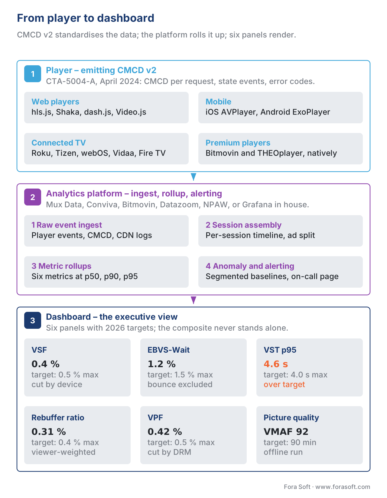 Figure 3. The 2026 dashboard architecture, end to end. The player emits CMCD v2; the ingest layer rolls events into the six core metrics; the dashboard surfaces them; alerts feed back into the operations playbook.
Segmentation: The Dashboard Is Useless Without Cuts
A single aggregate number — "VST p95 is 4.2 s" — is the start of a question, not an answer. The question is always for whom. Production dashboards segment every metric along at least these eight dimensions, and a serious incident-response playbook expects every alert to fire with at least three of them attached.
| Dimension | Why it matters | Typical cardinality |
|---|---|---|
| Device family (web, iOS, Android, Roku, Tizen, webOS, Vidaa, Fire TV, Android TV) | CTV is reliably worse on every metric; web players see the most change because of frequent app deploys | 8–15 |
| OS version | A specific OS minor release can break codec or DRM | 50–200 |
| App version | The first place to look after every rollout | 5–20 active at any time |
| CDN | A single edge failover is the most common single-cause QoE incident | 1–5 in active rotation |
| Geographic region | Last-mile networks vary by country, ISP, and time of day | 50–250 countries |
| Content type (live vs VOD, sports vs entertainment) | Live and sports tolerate less rebuffer than catalogue VOD | 5–50 |
| DRM system (Widevine, PlayReady, FairPlay) | A licence-server outage will surface as a per-DRM VPF spike | 3 |
| Network type (Wi-Fi, cellular, ethernet, satellite) | 5G FWA and Starlink users see materially different patterns | 3–6 |
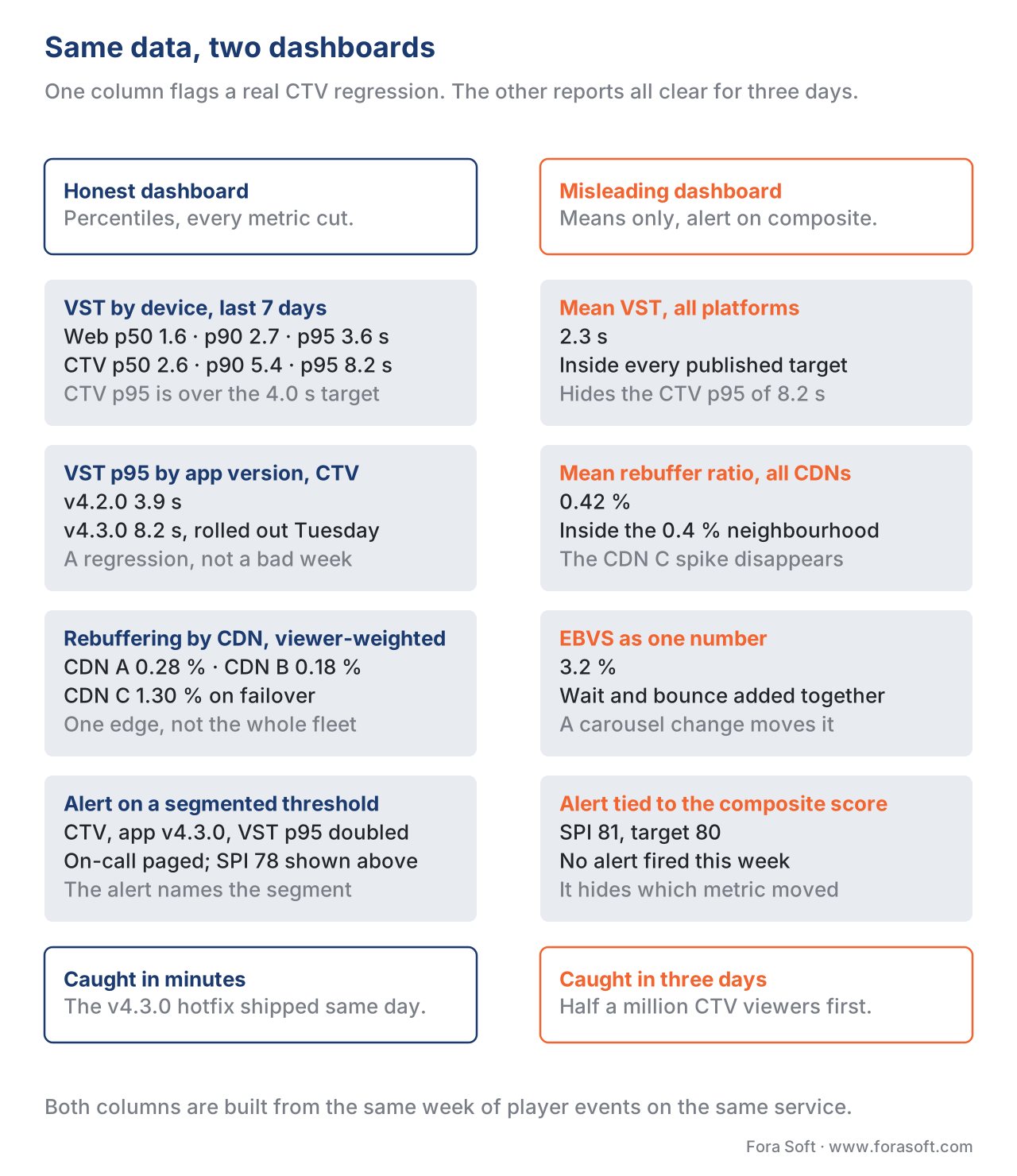 Figure 4. Same underlying data, two dashboards. The honest one shows p50, p90, p95 and segments by app version; the misleading one shows a single mean and an unsegmented composite score. The honest dashboard flags a real CTV regression; the misleading one shows green.
A Common Mistake: "Good for Everyone" Thresholds
The single most common QoE-dashboard failure we have seen is the fixed global threshold — the dashboard alerts when VST p95 exceeds 4.0 s, period, across the entire population. The threshold is good for web on a fibre line; it is bad for 4G in Indonesia, where 4.0 s p95 is the local steady-state. The dashboard either over-alerts (the on-call gets paged because Indonesia is performing normally) or sets the threshold to the Indonesian normal and never alerts on a fibre regression.
The fix is segmented thresholds: every alert is defined against a baseline that includes the same device family, the same region, and the same network type. Modern analytics vendors offer this natively — Mux's "Auto-Detected Alerts", Conviva's "Smart Alerts", Bitmovin's "Anomaly Detection" — and a custom dashboard built on Grafana can do it with a slightly more involved query. The price is dashboard complexity; the payoff is a pager that fires only when something is actually wrong.
A close cousin of the global-threshold mistake is alerting on the composite score. The composite hides which underlying metric moved, so the responder loses ten minutes to a question the dashboard should answer in three seconds. Alert on the underlying metrics, segmented by device and region; show the composite to the executive on the same screen.
The 2026 Reference Targets
The table below is the dashboard-target sheet our team uses as a starting point for a new client. It is calibrated against published Conviva and Mux benchmark ranges and our own production data from OTT and live-streaming engagements through May 2026. Targets are p95 latencies and viewer-level ratios, not means.
| Metric | Web | iOS | Android | CTV | Live | Notes |
|---|---|---|---|---|---|---|
| VSF | ≤ 0.5% | ≤ 0.3% | ≤ 0.5% | ≤ 1.0% | ≤ 0.8% | Below 0.3% is best-in-class |
| EBVS-Wait | ≤ 1.5% | ≤ 1.0% | ≤ 1.5% | ≤ 2.5% | ≤ 3.0% | Wait-driven only; bounce excluded |
| VST p50 | ≤ 2.0 s | ≤ 1.5 s | ≤ 2.0 s | ≤ 2.5 s | + 0.5–1.0 s | Below 1.0 s on web is best-in-class |
| VST p95 | ≤ 4.0 s | ≤ 3.0 s | ≤ 4.0 s | ≤ 5.0 s | + 1.0 s | Most useful operational target |
| Rebuffering Ratio | ≤ 0.4% | ≤ 0.3% | ≤ 0.4% | ≤ 0.6% | ≤ 0.8% | Viewer-weighted |
| VPF | ≤ 0.5% | ≤ 0.3% | ≤ 0.5% | ≤ 1.0% | ≤ 0.8% | Fatal post-start |
| VMAF p50 | ≥ 90 | ≥ 92 | ≥ 90 | ≥ 88 | ≥ 80 | Offline run; live uses bitrate proxy |
| Composite (SPI/VES/QoE) | ≥ 85 | ≥ 88 | ≥ 85 | ≥ 80 | ≥ 75 | Headline number; never the only one |
Where Fora Soft Fits In
Fora Soft has shipped QoE-instrumented players and dashboards across video conferencing, OTT, live-sports, e-learning, telemedicine, and video-surveillance projects since 2009, including the SDK plumbing for CMCD v2 emission, the segment-level analytics pipelines that feed Mux Data, Conviva, Bitmovin Analytics, Datazoom, and NPAW, and the custom Grafana dashboards operators use when no off-the-shelf vendor fits the brief. We routinely diagnose the five aggregation traps in production traffic, instrument CTV apps where the off-the-shelf SDK falls short, and rebuild bitrate ladders against VMAF when a service is shipping high bitrate at low perceptual quality. If your team has the metrics but cannot make them actionable, that is the gap we close. That work runs through our streaming software development practice, and for services already losing viewers to stalls our video performance troubleshooting engagement starts from exactly these dashboards.
The book
Video Streaming: A Complete Guide to Video Delivery — From ABR and CDNs to Players, WebRTC, DRM, and the Economics of Streaming
This page tells you which six numbers to watch. Volume 3 of the Fora Soft Video Engineering Handbook follows each of them back to its cause: ABR rung selection and buffer behaviour behind rebuffering ratio, CDN and cache behaviour behind startup time, player recovery behind VPF, and the delivery economics that decide what a point of rebuffering is worth in money. Its QoE-monitoring chapters are the long version of this article. Written by Nikolay Sapunov, CEO at Fora Soft.
Is your QoE dashboard telling you the truth?
Send us the dashboard you have and the player stack behind it, and we will tell you which aggregation traps it is standing on and what it costs to get off them. 250+ video products shipped since 2005.
See our case studies
Case study
Worldcast Live
HD concerts at 0.4–0.5 s glass-to-glass for 10,000 simultaneous viewers at 1.5 Gb/s. A buffer that shallow is exactly why the live rebuffering target sits at 0.8%, not the VOD 0.4%.
Case study
Sprii
72,000+ live shopping events across web, iOS and Android, with viewers staying 20 minutes instead of 54 seconds. One audience, three device families — and no useful number without the cut.
Case study
Speed.Space
Remote production at 1080p and 8 Mbps for Netflix, Electronic Arts and HBO. Picture quality is contractual here, which is why delivered VMAF belongs on the dashboard next to bitrate.
What to read next
Observability
Player Observability and the Metrics That Ship in Production
Where the six numbers come from: what a player has to emit before a dashboard can count anything.
Operations
Incident Response for Streaming: The Playbook
A panel went red. This is the runbook for the next thirty minutes.
Players
Smart TV Players: Tizen, webOS, Roku, Android TV, Fire TV, Vidaa
CTV is worse on every metric on this page. Here is why, device by device.
Encoding
Building a Bitrate Ladder: Classic Netflix, Per-Title, Per-Shot
Picture quality is the one metric you set in the ladder, not in the player.
References
- Consumer Technology Association. CTA-2066: Streaming Quality of Experience Events, Properties and Metrics. Published October 2020 by CTA WAVE; public draft hosted at github.com/cta-wave/R4WG20-QoE-Metrics. The normative source for VSF, EBVS, VST, Rebuffering Ratio, VPF, and Picture Quality definitions used in this article. Standards-tier source; this article uses CTA-2066's names and aggregation rules over any vendor-specific renaming.
- Consumer Technology Association. CTA-5004-A: Common Media Client Data (CMCD), Version 2. Published April 2024 by CTA WAVE. The normative source for the player-emitted event fields the six-metric core dashboard consumes. Standards-tier source; CMCD v1 (CTA-5004, 2020) is obsolete for new dashboards built in 2026.
- Krishnan, S. S., and Sitaraman, R. K. Video Stream Quality Impacts Viewer Behavior: Inferring Causality Using Quasi-Experimental Designs. Proceedings of the ACM Internet Measurement Conference 2012, pp. 211–224. The peer-reviewed source for the two-second startup-tolerance threshold and the 5.8-percentage-points-per-second abandonment slope. Academic-tier source; cited in this article wherever those numbers appear.
- DASH-IF / Streaming Video Technology Alliance. OTT Streaming Quality of Experience Requirements (SVTA-OTT-QOE-2022). August 2022. The SVTA cross-vendor working-group baseline for "what every dashboard should show". Industry-standard tier; supplements CTA-2066 with operator-side practice.
- Mux Inc. Changes to the Mux Viewer Experience Score. Mux Engineering Blog, 12 August 2024. The vendor reference for VES formula updates and the EBVS-under-1-second rule used in this article's EBVS discussion. Tier 3 (first-party vendor blog).
- Conviva Inc. Streaming Performance Index (SPI) — Conviva Docs. Conviva Learning Center, accessed May 2026 at docs.conviva.com. The vendor reference for SPI inputs (VSF, EBVS, VST, Rebuffering, VPF, Picture Quality) and the Good/Best threshold configurability used in the composite-score discussion. Tier 4 (vendor documentation).
- Netflix Technology Blog. Toward A Practical Perceptual Video Quality Metric. June 2016 (VMAF original release). The first-party reference for VMAF's design as a fusion-of-classical-metrics machine-learning predictor of subjective quality. Tier 3 (engineering blog from the spec's authors); the canonical academic VMAF references are subsequent IEEE papers from the LIVE lab at the University of Texas at Austin.
- Bitmovin GmbH. Video Developer Report 2025. Published Q4 2025, accessed May 2026. The industry-survey source used in this article for 2026-current adoption of CMCD v2 across player libraries and for the QoE-score component weights. Tier 4 (vendor analyst report).
- AWS / Amazon Web Services. Improving Video Observability with CMCD and CloudFront. AWS Networking & Content Delivery Blog, 2023, accessed May 2026. The vendor reference for CMCD v1-to-v2 migration patterns inside a major CDN. Tier 4 (vendor blog from a production deployer).
Internet-Draft note: CMCD v2 (CTA-5004-A) is a finalised CTA standard, not an Internet-Draft, and is not expected to change in the near term. The next revision under discussion at CTA WAVE in 2026 is CMCD v3, focusing on richer ad-domain fields; nothing in this article changes if v3 ships as proposed. CTA-2066 has been stable since the October 2020 publication, with no errata published as of May 2026.
