All comparisons of the vendors we actually build on. Each one starts from the same three questions: what a minute really costs, where the ceiling is, and what breaks once you are past the demo. No vendor paid for a place on this page, and we say where each one wins.
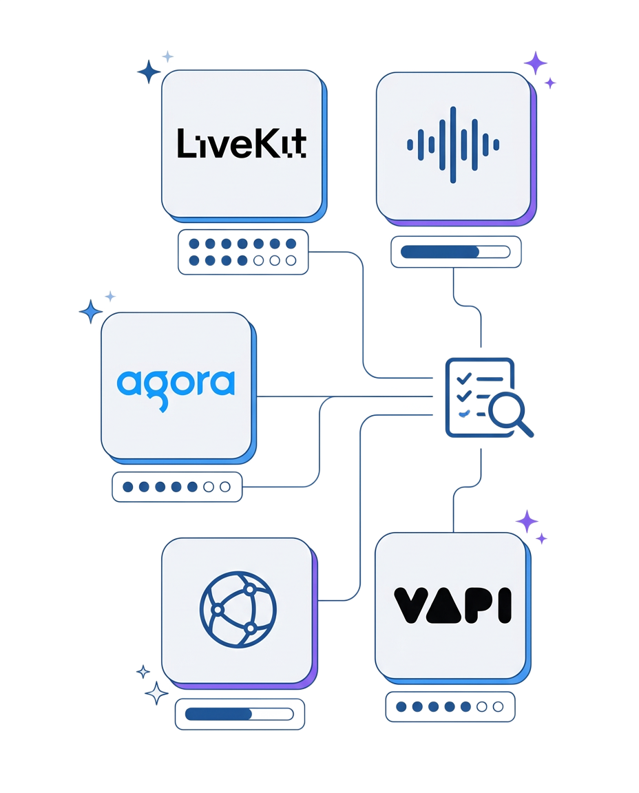
The infrastructure layer: who carries the media, what it costs per minute, and where each SDK stops being the cheap option.
The managed voice platforms and what they charge to run the orchestration you could own.
Synthetic presenters and the gap between a demo reel and a production pipeline.
Where the streams live and what the hosting bill looks like at scale.
The same five rows run through all fifteen comparisons, which is what makes them comparable to each other.
The advertised rate is the platform's slice. We add every model and carrier layer under it, because that is the number that lands on your invoice.
Concurrency, regions, and the point where the architecture stops being cheap. We name the volume, not the adjective.
Turn handling on noisy lines, reconnects on weak networks, recordings that have to survive an audit. Demo conditions tell you nothing about these.
Prompts and flows, or the repo, the data and the numbers. This is the row that decides most migrations.
Every comparison names the case where the vendor is the right answer. A page where nobody wins is a page nobody believes.
When the comparison ends with "none of them, own it", these are the builds on the other side.
Send the vendors you are weighing and last month's invoice. You get back the per-minute arithmetic on your own numbers, the ceiling you will hit first, and a straight answer on which one to pick. Yours to keep either way.

Within 24 hours you get a realistic estimate, technical recommendations and next steps. Free, no obligations.